Category: Recession Watch

Holy crap…look what we did with the credit market!

Holy crap…look what we did with the credit market!

| January 25, 2009 | Reply

Courtesy of a long chain of links (here’s where I found the graphic, over at Megan McArdle’s outstanding blog), here’s a chart showing total credit market debt as a percentage of US GDP: I’m not sure that vastly expanding the money supply in the United States is the right answer.  ..bruce w..

Read More

Holy crap…look what the Fed’s done with the money supply

Holy crap…look what the Fed’s done with the money supply

| January 24, 2009 | 1 Reply

Pardon my French, but everything else that came to mind was even more profane. Courtesy of The Corner at National Review Online comes the link to this chart showing how the Fed has pumped up the money supply lately: That little tiny blip around 2000 is apparently when the Fed “flooded” the money supply in […]

Read More

Financial Collapse – Round 2 Preview

Financial Collapse – Round 2 Preview

| January 15, 2009 | Reply

If you have been reading this blog and some other greats, you are probably aware that although the press would like you to think “the worst is behind us”, we are only looking at the end of the first phase of the collapse. 2008 saw the beginning of the massive deflationary cycle that kicked off […]

Read More

The $50 billion Ponzi scheme

The $50 billion Ponzi scheme

| December 20, 2008 | Reply

The New York Times has an outstanding and lengthy article tracing the rise of the Madoff investment firm that, in the end, turned out to be (in Madoff’s own words) a $50 billion Ponzi scheme: The juggernaut began to sputter this fall as investors, rattled by the financial crisis and reaching for cash, started taking […]

Read More

Worldwide Banking System Leverage

Worldwide Banking System Leverage

| December 14, 2008 | Reply

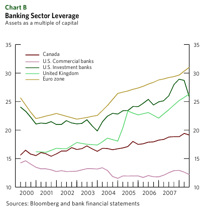
For those of you who missed it, in this downward spiral we are now enduring, the amount of leverage (read, debt) is directly related to how fast your bank is going to go under. Now from a blog named Infectious Greed, comes this chart extracted from a Bank of Canada report: So according to the […]

Read More

The financial crisis illustrated

The financial crisis illustrated

| December 8, 2008 | Reply

“Because Secretary Paulson had struggled in previous attempts to explain what the big banks and brokerage houses had done to the U.S. economy, his staff prepared a visual aid that told the story in clear and graphic terms.” Winner of Dave Barry’s caption contest for the above photo.  ..bruce w..

Read More

CDOs explained (or, “Holy crap!”)

CDOs explained (or, “Holy crap!”)

| December 2, 2008 | 1 Reply

Alan Kohler at the Business Spectator down in Australia does his best to explain CDOs, CDSs, and SPVs, then gets down to brass tacks: It is now getting very interesting. The three Icelandic banks have defaulted, as has Countrywide, Lehman and Bear Stearns. AIG has been taken over by the US Government, which is counted […]

Read More

What goes up must come down

What goes up must come down

| November 26, 2008 | Reply

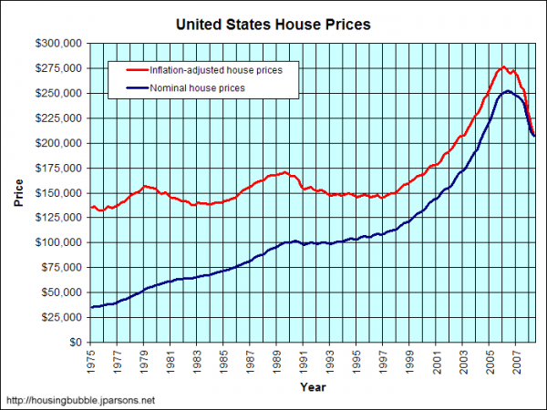
Here’s a graph of US housing prices since 1975, both the stated prices and the same prices adjusted for inflation: As you can see, once you adjust for inflation, housing prices have peaked and then fallen three times in the last 30 years. I remember looking at a $35,000 house in the semi-rural area near […]

Read More

Yet another bailout request

Yet another bailout request

| November 26, 2008 | Reply

Hell, this makes more sense than a lot of what Congress and the US Treasury are doing right now: True fact: I own a Pets.com sock puppet. I keep it in my office to remind me of the idiocies of the late 90s Tech Bubble. Problem is, I’m not the one who needs reminding. Hat […]

Read More

Is this what “trickle-down economics” means?

Is this what “trickle-down economics” means?

| November 25, 2008 | Reply

Image o’ the day: At least the contribution is voluntary. Hat tip to The Consumerist.  ..bruce w..

Read More